Specifying anti-aliasing
- None to apply no anti-aliasing.
- Sharp to make type appear the most sharp.
- Crisp to make type appear somewhat sharp.
- Strong to make type appear heavier.
- Smooth to make type appear smoother.
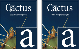
Anti-aliasing lets you produce smooth-edged type by partially filling the edge pixels. As a result, the edges of the type blend into the background.
When creating type for online use, consider that anti-aliasing greatly increases the number of colors in the original image. This limits your ability to reduce the number of colors in the image and thus reduce the optimized file size, and may cause stray colors to appear along the edges of the type. When file size and limiting the number of colors is most important, leaving type without anti-aliased edges may be preferable, despite the jagged edges. Also, consider using larger type than you would use for printed works. Larger type can be easier to view online and gives you more freedom in deciding whether to apply anti-aliasing to type.
Note: When you use anti-aliasing, type may be rendered inconsistently at small sizes and low resolutions (such as the resolution used for Web graphics). To reduce this inconsistency, deselect the Fractional Width option in the Character palette menu.
Anti-aliasing options include:
To apply anti-aliasing to a type layer:
- Select the type layer in the Layers palette.
- Do one of the following:
- Choose an option from the anti-aliasing menu
 in the options bar or the Character palette.
 - Choose Layer > Type, and choose an option from the submenu.